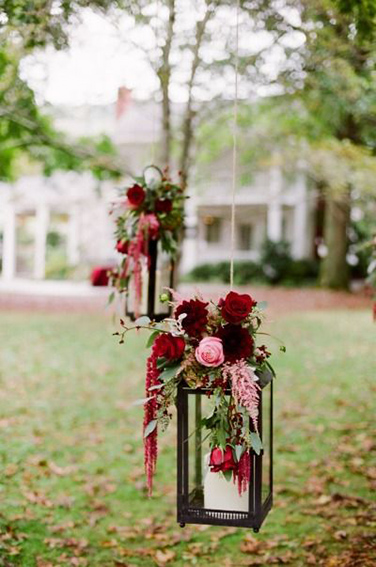
Photo Source: itsjustaddloveshow.tumblr.com
Will the Pantone Color of the Year 2015 be your wedding color too? For those who are unaware of Pantone’s Color of the Year 2015, it’s Marsala! Sounds strange to you?We thought so too, in the beginning, before we set our eyes on the color. Marsala is named after the Italian wine. It’s a brownish red that adds warmth and sophistication to your wedding color palette. The Pantone Color Institute defines this color assensual, bold and delicious.

Photo Source: burnettsboards.com
We personally love the versatility of this color. Marsala doesn’t just go great with neutrals like ivory, but it’s also pretty with vibrant summer colors like bright corals.
Now, when it comes to designing wedding stationery, there are two ways of using Marsala. You can use it as a primary color, because it has the ability to stand alone like a bold canvas. You can decorate it with gold, silver or white as font color to create that elegant feel. You can also use Marsala simply as an accent in your wedding stationeries. Get on the trend bandwagon with this color by combining it with turquoise, ivory and slate, where you can create a graphic statements with modern and fabulous twists.

Photo Source: stylemepretty.com
When you have set your heart on the color palette, you can start designing your wedding stationeries, starting from the invitation, to coordinating napkins, to thank you cards, place cards and table number to match the whole design. You can add an “earthy” feel to your wedding by attaching dried leaves or potpourri onto your printed items. Don’t forget to go the extra mile: for unique and personalized stationery that will enchant your guests, you can use hand-drawn illustrations or letterings.

Photo Source: tulleandchantilly.com
The color of Marsala is as good as the fortified wine. You can go all out or use as subtle hints, but the color itself is deep enough to make a big statement throughout your paper products. It’s your call. Have fun!
Love,
Butterfly


